Adiyat Racing
Plus
dubai racing club · Dubai
Art Direction | Graphic Design | Editorial Design
Exhibition Graphics | Digital & Social

Overview
Adiyat Racing Plus (AR+) is a leading UAE horse racing magazine, funded and supported by the Dubai Government. Named by HH Sheikh Mohammed bin Rashid Al Maktoum, the weekly publication has delivered comprehensive coverage of horse racing and equestrian sports in both Arabic and English since its launch on 4 November 1994.
With renowned international correspondents, AR+ covers major horse racing events worldwide, alongside endurance, show jumping and polo, building a strong following across the UAE.

STRATEGY. RESEARCH.
DESIGN.
The AR+ rebranding process began with comprehensive research, including stakeholder workshops, industry analysis and audience research. Working closely with the CEO, Managing Editor, design and marketing teams, and editors provided valuable insights into the needs and expectations of the target audience.
These insights shaped the development of AR+, from refining its content and platforms to improving usability and creating a stronger, more distinctive brand identity.
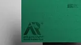
Strength. Speed. Excellence.
The AR+ logo captures the power, elegance and prestige of horse racing while representing the wider world of equestrian sports. Its minimalist design features a stylized horse’s head, with the letters A and R seamlessly integrated into the form, creating a bold and distinctive identity.
The + symbol represents the brand’s expansion beyond racing to include show jumping, dressage, polo, Arabian horse shows, events and auctions.
A clean, contemporary sans-serif typeface reinforces the modern identity, while the colour palette reflects the character of the brand. Dark green represents strength and elegance, light green symbolizes growth and innovation, while gold and silver convey luxury and excellence, reflecting Dubai’s position as a global equestrian destination.
before
after


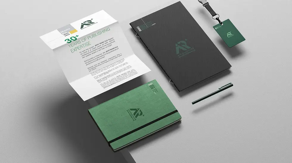
The branding was developed to work consistently across team apparel, caps, event banners, signage, promotional materials, digital platforms and editorial design.
Each application demonstrates how the identity can adapt across print, environmental and digital media while maintaining a premium and recognizable presence.
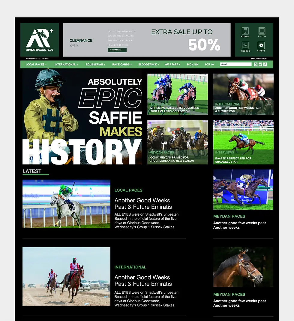
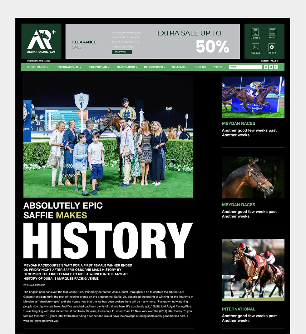
CONNECTED. RESPONSIVE. SEAMLESS.
The AR+ digital experience extends the brand beyond print, creating a connected platform where readers can explore racing, equestrian culture, news and stories. Strong typography, refined layouts and the AR+ colour palette create a distinctive and consistent digital identity.
Designed responsively for desktop and mobile, the experience adapts naturally across screens while maintaining the visual character of AR+ and keeping navigation clear, fast and intuitive.


INSTANT. DIRECT. SHAREABLE.
The AR+ WhatsApp edition brings the magazine closer to its audience through a fast, accessible and familiar mobile format. Selected stories, news and visual content were adapted specifically for WhatsApp while maintaining the distinctive AR+ visual identity.
More than a standalone channel, WhatsApp acts as a bridge between AR+ platforms, encouraging readers to explore and share content while driving traffic to the website and social media.


ENGAGING. DYNAMIC. CONNECTED
The AR+ social media presence extends the brand through a consistent and recognizable visual language. Strong editorial layouts, bold typography, impactful imagery and the AR+ identity transform stories, racing coverage and key moments into engaging content for fast-moving social feeds.
The system connects AR+ platforms while adapting content to each social channel, helping increase reach, encourage interaction and strengthen the brand’s digital presence.


EDITORIAL. CRAFT. PRESTIGE.
AR+ was designed as a premium editorial experience combining the energy of horse racing, equestrian sport and contemporary lifestyle. I developed a distinctive editorial system built around strong typography, dynamic compositions, refined imagery and a carefully considered grid, giving each story its own character while maintaining consistency throughout the publication.
From covers and feature spreads to photography, typography and supporting graphics, every element balances visual impact with readability. The result is a sophisticated publication that reflects the strength, elegance and prestige of the world AR+ represents.


